
Peppermint Oil, poems by John Coletti. Cover art courtesy of Thomas Burke. Photopolymer plate and handset Centaur type. Printed at Impart Ink in collaboration with the publishers, PUSH press. Available here: http://push-press.blogspot.com/
Death Under Construction
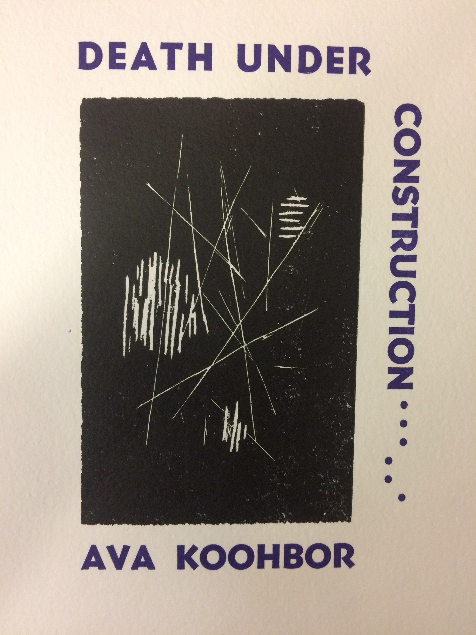
Death Under Construction, by Ava Koohbor - 88 pages, 7x9.5" - perfect bound in two-color letterpress wrappers printed from a linoleum block carved by the author and handset type - co-published with Ugly Duckling Presse in an edition of 600 copies -- available now.
A Cast of Wonders
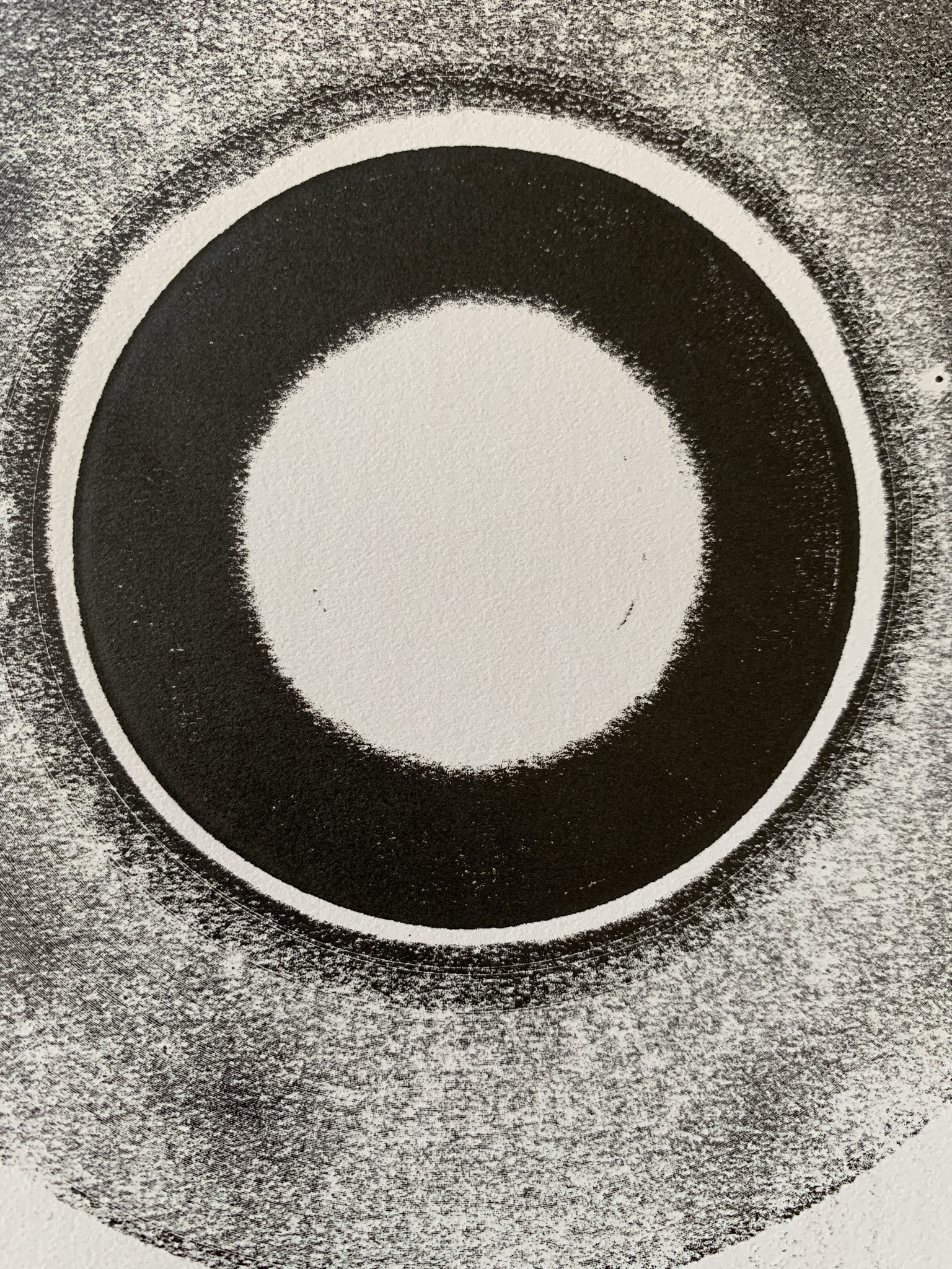
A Cast of Wonders, by Clark Coolidge - 26 pages, 5.25x8.5" - handsewn in two-color letterpress wrappers printed from a 45-rpm record and handset type - An Ensemble Edition, co-published with Bootstrap Press in an edition of 200 copies -- available now.
Tin Pan Alley

"Tin Pan Alley," a poem by Bob Kaufman. Libra and Goudy Oldstyle type with 24 pt. lead ornament design. Printed at Impart Ink for Unrequited Records. Proceeds to benefit the poet's son, Parker. Available here: http://www.unrequitedrecords.com/
Gossamer Nevele Grimoire
Gossamer Nevele Grimoire, by Derek Fenner – 36 pages, 9″x6″, two-color printing throughout, in letterpress wrappers – published in a limited edition of one-hundred copies, designed and printed at Impart Ink, an errant studio in Oakland and Santa Cruz, for Bird & Beckett Books (San Francisco) – available January 2020 – available now
Daily Vigs
Daily Vigs, by Micah Ballard - 36 pages, 8"x5.375" in letterpress wrappers - published in a limited edition of two-hundred copies, designed and printed at Impart Ink, an errant studio in Oakland and Santa Cruz, for Bird & Beckett Books (San Francisco) - order now
No Right Words
No Right Words, poems by Rod Roland - An Ensemble Edition, co-published by Bird & Beckett Books (San Francisco) and Ugly Duckling Presse (New York) - 32 pages, 7"x9.5" in letterpress wrappers courtesy of Impart Ink, an errant studio in Oakland and Santa Cruz - available now.
Three +3
In the past couple of months I've been busy in the press. The second series of SLUG.DOCS has hit the streets: a trio of chapbooks by fellow candidates in the Creative/Critical concentration of the Literature doctoral program at UCSC. The first set in 2016 was the pair of Clean and Shiny, by Eric Sneathen andContinue reading "Three +3"
What’s Going On
Today I sewed the first copy of Sunnylyn Thibodeaux's What's Going On, the latest chapbook from Bird & Beckett. The remainder of the edition remains to be sewn and the volumes trimmed, but I'm so happy to be putting this one out that I thought I'd go ahead and post a few images and makeContinue reading "What’s Going On"
Amerarcana/Shuffle Boil #7
This fall I've had precious little time to print, but I have managed to get a couple of projects underway, one of which came to fruition this week when I received 8 boxes of the 7th issue of my roughly annual magazine, AMERARCANA: A Bird & Beckett Review, which was guest edited this time aroundContinue reading "Amerarcana/Shuffle Boil #7"
